Have you ever visited a site only to quickly close out of it because your eyes can't bare to look at it? You can't find the information you need quickly, and well, you just don't have the time or patience to dig through the mess on your screen?
There are three very important things to focus on when trying to make your site more reader friendly: text, colors, and layout. For this post, I'm going to concentrate on text.
First, you really want to stick with one font family for the entire site. While this may seem boring to some, this makes reading through your site very easy which makes your readers happy! Consider a popular site like Facebook. They use the same font family throughout the site and have tons of happy users that spend hours on their site every day.
In most cases, you should pick only about 4 different font sizes to use throughout your site. Here's how these sizes should be used:
Largest font size: Use this one for the h1 tag which needs to be used for page titles. The title should be the most important content on your page.
2nd largest font size: Use this for the h2 tag - perfect for the second most important content on your page like section headers.
3rd largest font size: This size is great for your paragraphs, or the majority of your content.
Smallest font size: You can use this for another header tag, or just a span. This size can actually be relatively small and be used for things like image captions or side notes.
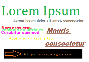
In the example below from one of our sites, we are only using three font sizes. Readers can quickly browse this section and know exactly what it's about! When you can find information you need quickly and easily, doesn't that make you happy?
Finally, make sure that letter spacing, line height, and the spacing between paragraphs also encourages easy reading. Think of it this way - if you cannot stand to read through an entire article on your site, then there is probably no one else out there that will want to either! I actually changed our settings after trying to read through my first blog post.
The font related settings for our blog's content are now:
font-family: "Georgia",serif;
font-size: 14px;
line-height: 28px;
(for paragraphs) margin-bottom : 2em;
I hope you found this information helpful. I will be writing soon about how the colors and layout of your site can also make a huge difference in your site's readability.
blog comments powered by Disqus 325.261.0002